SlideShare uma empresa Scribd logo
1 de 4
Analysis of Front Cover #1

For this magazine front cover, the masthead is in the left hand third, this is
because the name is abbreviated and would take up too much room if it were
enlarged. The name, NME is in red, this is to make it stand out against the black
and white border, this also makes it easy to see from a distance, existing fans will
be able to see the name NME and instantly know to buy it. The white lining
around the text adds to how bold it is. Red and white are typical colours that are
found throughout the magazine which creates better brand identity. The
masthead is written in a simple, bold font, this also makes it easier to read,
especially from a distance, so fans will recognise the magazine easily when
displayed on a shelf with other magazines.
The artists names and articles on the front cover are in yellow text, this easily
draws the readers attention so they can see what artists are featured. By making
the cover eye catching and giving a glimpse of what is inside will make the
reader want to pick the magazine up and hopefully make them more likely to buy
it.
The magazine has a sell line saying “V Festival special issue”, this directly links
to the main image, the artist is standing in a field. It is common for festivals to
take place in fields and large open spaces, this adds to the brand identity as it
establishes that it is a rock magazine of some sort. There are only two other
images on the cover, these are related to other articles inside the magazine, this
means that the main focus of the issue is on the festival as it's biggest image,
placing the most importance on it. The artist in the main image looks very
serious, this shows that the genre is serious compared to a genre like pop, where
most of the artists are seen smiling. It gives the impression that the magazine
won't be full of gossip and will be more information based.
The pug is in the bottom right; this is the last place the reader will look on the
cover, the idea for this being that once the reader has been enticed into buying
the magazine by the eye catching cover, they will see the price. Seeing the price
first may put some readers off of buying the magazine.
There is a puff on the right hand side, just above the main sell line, it reads “as
chosen by you!”, this direct address shows that the magazine is more personal
and the reader can make a contribution, if the magazine feels personal then
readers are more likely to buy it.
A lot of the text has a border around it, this is to help make it stand out more
against the background, if the reader can't see the text properly they won't bother
reading it. A lot of the borders and text boxes look like torn paper, this gives the
magazine a very hand-made look and personal feel, it also fits in with the festival
issue, as there would be many magazines that will be passed around and left on
the ground, they will get torn and damaged.
The front cover follows typical conventions you would expect from, such as
having important content in the left hand third and having the pug in the bottom
right corner so it is the last thing the reader will see.

Analysis of Front Cover #2
For this issue of Q magazine, the logo is at the front of the main image, this is
because it would be covered too much if it was behind the main image and would
be unreadable.
There is a lot of text on this front cover; it fills most of the cover in a variety of
colours and sizes. The cover mostly uses black, red and gold for the text, the
black and red are commonly found on Q magazine, as the logo is mostly red.
Black is used as it stands out on the light-grey background. Gold is used as it
makes the magazine look and feel more like a “premium” magazine and
connotes wealth. Seeing as the target audience of Q magazine is middle to
upper class men with high disposable income this colour fits in well. The
masthead is very simple, it is one large square, this makes the magazine feel
minimalistic and modern, this also makes the magazine look more sophisticated.
The magazine cover has a pull quote from one of the articles inside, “Noel was a
t*t. I’m very happy…” this is to entice readers into buying the magazine as it
makes the magazine look like it contains drama. Many issues of Q magazine
have a cover wrap over them, this is to prevent readers from flicking through and
reading articles they want and then not buying the magazine. The cover wrap
also adds to the idea that Q is a premium magazine. Pull quotes are taken from
interviews from artists, sometimes only a snippet of the quote is used thus
making the enquisitive reader want to know what else was said.
It is a common convention of magazines to have the a pug in the bottom right
corner of the magazine as in Western culture it is the last place the reader will
look. This also gives the reader a chance to read the entire front cover before
seeing the price, this will hopefully entice the reader into buying the magazine, if
they saw the price first they may be off put and not read the rest of the front
cover.
The entire cover looks very neat and simplistic, giving it a modern look. This is
very different to magazine covers from NME and KERRANG! This represents the
target audience who would probably enjoy modern art styles.
Most of the sell lines include the artist's names, this is so fans of the artists will
see their names and be more likely to pick the magazine up and potentially buy
it.
The main image contains a close up of an artist, the colours are very pale and
faded, along with the background, they look like they have a hint of gold in them
which is commonly featured, this adds to the premium feel of the magazine.
The magazine cover overall is very effective at drawing in readers, it uses bold
and familiar colours to entice established readers. As the colours are bold, they
make the magazine stand out to everyone, including new readers. The fonts
used are also bold and take up a lot of the cover, most of the text is artist’s
names, this is the biggest text as somebody may recognised the artist’s name
and decide to buy the magazine, because of all of these things, the magazine
cover is successful in performing its task, it follows conventions of typical music
magazines but breaks them when necessary. It also has its own unique look and
appeals to its target audience.
The magazine also follows conventions such as having important information in
the left hand third. The cover only features one image, this is to put emphasis on
the article it is related to, it is supposed to be the highlight of the issue and wants
the readers to have a look at that particular article.
The magazine doesn't feature any mode of address on the cover which is
unusual for a magazine, this is probably the only convention it doesn't follow that
would benefit it. On the other hand there isn't anywhere to put direct address, this
is because the magazine isn't doing anything that can make the readers interact,
such as giveaways or reader input.

Mais conteúdo relacionado

Mais procurados

Task 3 research bmth
Task 3 research bmthTask 3 research bmth
Task 3 research bmthasmediae15
 
Format research of music magazines
Format research of music magazinesFormat research of music magazines
Format research of music magazinesellisputnam
 
AS Media Magazine design layout
AS Media Magazine design layoutAS Media Magazine design layout
AS Media Magazine design layoutPetramediastudies
 
Music magazine research
Music magazine researchMusic magazine research
Music magazine researchbroganlan
 
Media Music Magazine Analysis
Media Music Magazine AnalysisMedia Music Magazine Analysis
Media Music Magazine Analysisyasminesadr
 
Task 2 mojo
Task 2 mojoTask 2 mojo
Task 2 mojodenhamj1
 
Contents page analysis.
Contents page analysis.Contents page analysis.
Contents page analysis.Levita123
 
Kerrang analysis
Kerrang analysisKerrang analysis
Kerrang analysisasmediac14
 
Magazine research
Magazine researchMagazine research
Magazine researchemily1082
 
Article analysis 2
Article analysis 2Article analysis 2
Article analysis 2Egideee
 
Media q1
Media q1Media q1
Media q1zainyc4
 
Article Analysis - AS Media Studies
Article Analysis - AS Media StudiesArticle Analysis - AS Media Studies
Article Analysis - AS Media Studiesciaraoakes
 
Kerrang!
Kerrang!Kerrang!
Kerrang!J_h45
 
Gossip Magazine Cover Analysis
Gossip Magazine Cover Analysis Gossip Magazine Cover Analysis
Gossip Magazine Cover Analysis JoynesEllie
 
Analysing music magazines
Analysing music magazinesAnalysing music magazines
Analysing music magazinesasmediag13
 
Magazine Planning
Magazine PlanningMagazine Planning
Magazine Planningcobes1
 

Mais procurados (20)

Magazine anaylsis
Magazine anaylsisMagazine anaylsis
Magazine anaylsis
 
Task 3 research bmth
Task 3 research bmthTask 3 research bmth
Task 3 research bmth
 
Format research of music magazines
Format research of music magazinesFormat research of music magazines
Format research of music magazines
 
AS Media Magazine design layout
AS Media Magazine design layoutAS Media Magazine design layout
AS Media Magazine design layout
 
Music magazine research
Music magazine researchMusic magazine research
Music magazine research
 
Media Music Magazine Analysis
Media Music Magazine AnalysisMedia Music Magazine Analysis
Media Music Magazine Analysis
 
Task 2 mojo
Task 2 mojoTask 2 mojo
Task 2 mojo
 
Media
MediaMedia
Media
 
Contents page analysis.
Contents page analysis.Contents page analysis.
Contents page analysis.
 
Kerrang analysis
Kerrang analysisKerrang analysis
Kerrang analysis
 
Magazine research
Magazine researchMagazine research
Magazine research
 
Article analysis 2
Article analysis 2Article analysis 2
Article analysis 2
 
Media q1
Media q1Media q1
Media q1
 
Article Analysis - AS Media Studies
Article Analysis - AS Media StudiesArticle Analysis - AS Media Studies
Article Analysis - AS Media Studies
 
Kerrang!
Kerrang!Kerrang!
Kerrang!
 
Gossip Magazine Cover Analysis
Gossip Magazine Cover Analysis Gossip Magazine Cover Analysis
Gossip Magazine Cover Analysis
 
Market research
Market researchMarket research
Market research
 
Analysing music magazines
Analysing music magazinesAnalysing music magazines
Analysing music magazines
 
Magazine Planning
Magazine PlanningMagazine Planning
Magazine Planning
 
Market research1
Market research1Market research1
Market research1
 

Destaque

ENGELBERT HUMPERDINCK - (Yago Vicente Rañó)
ENGELBERT HUMPERDINCK - (Yago Vicente Rañó)ENGELBERT HUMPERDINCK - (Yago Vicente Rañó)
ENGELBERT HUMPERDINCK - (Yago Vicente Rañó)Univ. of Boston
 
Photo sebar brosur malang
Photo sebar brosur malangPhoto sebar brosur malang
Photo sebar brosur malangBagus Bagus
 
Global Medical Cures™ | Drugs approved for Breast Cancer
Global Medical Cures™ | Drugs approved for Breast CancerGlobal Medical Cures™ | Drugs approved for Breast Cancer
Global Medical Cures™ | Drugs approved for Breast CancerGlobal Medical Cures™
 
Collective nouns
Collective nounsCollective nouns
Collective nounsmoonai
 
Crissiotis powerpoint
Crissiotis powerpointCrissiotis powerpoint
Crissiotis powerpointcrissiotis
 
Statics of Rigid Bodies
Statics of Rigid BodiesStatics of Rigid Bodies
Statics of Rigid BodiesKate Manuel
 
어플소셜커머스모델 제안 Jhy_12.10.09
어플소셜커머스모델 제안 Jhy_12.10.09어플소셜커머스모델 제안 Jhy_12.10.09
어플소셜커머스모델 제안 Jhy_12.10.09지환 윤
 
Leadership Matters Publication August 2013
Leadership Matters Publication August 2013Leadership Matters Publication August 2013
Leadership Matters Publication August 2013Grace S. Park
 
Photo locations
Photo locationsPhoto locations
Photo locationsVarosite
 
оновлене портфоліо
оновлене портфоліооновлене портфоліо
оновлене портфоліоannajni
 

Destaque (16)

ENGELBERT HUMPERDINCK - (Yago Vicente Rañó)
ENGELBERT HUMPERDINCK - (Yago Vicente Rañó)ENGELBERT HUMPERDINCK - (Yago Vicente Rañó)
ENGELBERT HUMPERDINCK - (Yago Vicente Rañó)
 
Bigspeech1
Bigspeech1Bigspeech1
Bigspeech1
 
Cle kawabata
Cle kawabataCle kawabata
Cle kawabata
 
Look walkers in hyderabad & secunderabad
Look walkers in hyderabad & secunderabadLook walkers in hyderabad & secunderabad
Look walkers in hyderabad & secunderabad
 
Photo sebar brosur malang
Photo sebar brosur malangPhoto sebar brosur malang
Photo sebar brosur malang
 
Unit plan nhom02
Unit plan nhom02Unit plan nhom02
Unit plan nhom02
 
Global Medical Cures™ | Drugs approved for Breast Cancer
Global Medical Cures™ | Drugs approved for Breast CancerGlobal Medical Cures™ | Drugs approved for Breast Cancer
Global Medical Cures™ | Drugs approved for Breast Cancer
 
Collective nouns
Collective nounsCollective nouns
Collective nouns
 
Crissiotis powerpoint
Crissiotis powerpointCrissiotis powerpoint
Crissiotis powerpoint
 
Unit plan nhom02
Unit plan nhom02Unit plan nhom02
Unit plan nhom02
 
Statics of Rigid Bodies
Statics of Rigid BodiesStatics of Rigid Bodies
Statics of Rigid Bodies
 
어플소셜커머스모델 제안 Jhy_12.10.09
어플소셜커머스모델 제안 Jhy_12.10.09어플소셜커머스모델 제안 Jhy_12.10.09
어플소셜커머스모델 제안 Jhy_12.10.09
 
Leadership Matters Publication August 2013
Leadership Matters Publication August 2013Leadership Matters Publication August 2013
Leadership Matters Publication August 2013
 
Informatika
InformatikaInformatika
Informatika
 
Photo locations
Photo locationsPhoto locations
Photo locations
 
оновлене портфоліо
оновлене портфоліооновлене портфоліо
оновлене портфоліо
 

Semelhante a Front cover analysis

Coursework document
Coursework documentCoursework document
Coursework documentJoe Pearce
 
Magazine analysis
Magazine analysisMagazine analysis
Magazine analysisemzywmzy087
 
Task 3 nme arctic monkeys
Task 3 nme arctic monkeys Task 3 nme arctic monkeys
Task 3 nme arctic monkeys quinnf1
 
Analysis of magazines (1)
Analysis of magazines (1)Analysis of magazines (1)
Analysis of magazines (1)sherieallen
 
music magazine Front cover annotations
music magazine Front cover annotations music magazine Front cover annotations
music magazine Front cover annotations natashatandy100
 
Magazine analysis finshed
Magazine analysis finshedMagazine analysis finshed
Magazine analysis finshedBhullarA1
 
The Music Magazine Industry
The Music Magazine IndustryThe Music Magazine Industry
The Music Magazine Industryizzymoore99
 
Nme front cover analysis
Nme front cover analysisNme front cover analysis
Nme front cover analysisasmediaf13
 
Music magazine analysis
Music magazine analysisMusic magazine analysis
Music magazine analysisBailey Shooter
 
Pop music magazine
Pop music magazinePop music magazine
Pop music magazineKlarasa098
 
Front covers, contents pages, double page spreads #5
Front covers, contents pages, double page spreads #5Front covers, contents pages, double page spreads #5
Front covers, contents pages, double page spreads #5QureshiSohail
 
Music magazine research
Music magazine researchMusic magazine research
Music magazine researchbroganl4
 
Textual Analysis - Media Studies
Textual Analysis - Media StudiesTextual Analysis - Media Studies
Textual Analysis - Media StudiesNorah Fields
 
Analysing music magazines tasks 1,2,3
Analysing music magazines tasks 1,2,3Analysing music magazines tasks 1,2,3
Analysing music magazines tasks 1,2,3asmediag13
 
Analysing music magazines tasks 1,2,3
Analysing music magazines tasks 1,2,3Analysing music magazines tasks 1,2,3
Analysing music magazines tasks 1,2,3asmediag13
 

Semelhante a Front cover analysis (20)

Cover research
Cover researchCover research
Cover research
 
Magazine analysis
Magazine analysis Magazine analysis
Magazine analysis
 
Coursework document
Coursework documentCoursework document
Coursework document
 
Media
MediaMedia
Media
 
Magazine analysis
Magazine analysisMagazine analysis
Magazine analysis
 
Analysis of magazines
Analysis of magazinesAnalysis of magazines
Analysis of magazines
 
Task 3 nme arctic monkeys
Task 3 nme arctic monkeys Task 3 nme arctic monkeys
Task 3 nme arctic monkeys
 
Analysis of magazines (1)
Analysis of magazines (1)Analysis of magazines (1)
Analysis of magazines (1)
 
music magazine Front cover annotations
music magazine Front cover annotations music magazine Front cover annotations
music magazine Front cover annotations
 
Magazine analysis finshed
Magazine analysis finshedMagazine analysis finshed
Magazine analysis finshed
 
The Music Magazine Industry
The Music Magazine IndustryThe Music Magazine Industry
The Music Magazine Industry
 
Nme front cover analysis
Nme front cover analysisNme front cover analysis
Nme front cover analysis
 
Front cover
Front coverFront cover
Front cover
 
Music magazine analysis
Music magazine analysisMusic magazine analysis
Music magazine analysis
 
Pop music magazine
Pop music magazinePop music magazine
Pop music magazine
 
Front covers, contents pages, double page spreads #5
Front covers, contents pages, double page spreads #5Front covers, contents pages, double page spreads #5
Front covers, contents pages, double page spreads #5
 
Music magazine research
Music magazine researchMusic magazine research
Music magazine research
 
Textual Analysis - Media Studies
Textual Analysis - Media StudiesTextual Analysis - Media Studies
Textual Analysis - Media Studies
 
Analysing music magazines tasks 1,2,3
Analysing music magazines tasks 1,2,3Analysing music magazines tasks 1,2,3
Analysing music magazines tasks 1,2,3
 
Analysing music magazines tasks 1,2,3
Analysing music magazines tasks 1,2,3Analysing music magazines tasks 1,2,3
Analysing music magazines tasks 1,2,3
 

Front cover analysis

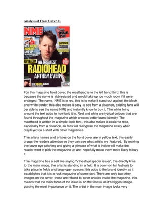
  • 1. Analysis of Front Cover #1 For this magazine front cover, the masthead is in the left hand third, this is because the name is abbreviated and would take up too much room if it were enlarged. The name, NME is in red, this is to make it stand out against the black and white border, this also makes it easy to see from a distance, existing fans will be able to see the name NME and instantly know to buy it. The white lining around the text adds to how bold it is. Red and white are typical colours that are found throughout the magazine which creates better brand identity. The masthead is written in a simple, bold font, this also makes it easier to read, especially from a distance, so fans will recognise the magazine easily when displayed on a shelf with other magazines. The artists names and articles on the front cover are in yellow text, this easily draws the readers attention so they can see what artists are featured. By making the cover eye catching and giving a glimpse of what is inside will make the reader want to pick the magazine up and hopefully make them more likely to buy it. The magazine has a sell line saying “V Festival special issue”, this directly links to the main image, the artist is standing in a field. It is common for festivals to take place in fields and large open spaces, this adds to the brand identity as it establishes that it is a rock magazine of some sort. There are only two other images on the cover, these are related to other articles inside the magazine, this means that the main focus of the issue is on the festival as it's biggest image, placing the most importance on it. The artist in the main image looks very
  • 2. serious, this shows that the genre is serious compared to a genre like pop, where most of the artists are seen smiling. It gives the impression that the magazine won't be full of gossip and will be more information based. The pug is in the bottom right; this is the last place the reader will look on the cover, the idea for this being that once the reader has been enticed into buying the magazine by the eye catching cover, they will see the price. Seeing the price first may put some readers off of buying the magazine. There is a puff on the right hand side, just above the main sell line, it reads “as chosen by you!”, this direct address shows that the magazine is more personal and the reader can make a contribution, if the magazine feels personal then readers are more likely to buy it. A lot of the text has a border around it, this is to help make it stand out more against the background, if the reader can't see the text properly they won't bother reading it. A lot of the borders and text boxes look like torn paper, this gives the magazine a very hand-made look and personal feel, it also fits in with the festival issue, as there would be many magazines that will be passed around and left on the ground, they will get torn and damaged. The front cover follows typical conventions you would expect from, such as having important content in the left hand third and having the pug in the bottom right corner so it is the last thing the reader will see. Analysis of Front Cover #2
  • 3. For this issue of Q magazine, the logo is at the front of the main image, this is because it would be covered too much if it was behind the main image and would be unreadable. There is a lot of text on this front cover; it fills most of the cover in a variety of colours and sizes. The cover mostly uses black, red and gold for the text, the black and red are commonly found on Q magazine, as the logo is mostly red. Black is used as it stands out on the light-grey background. Gold is used as it makes the magazine look and feel more like a “premium” magazine and connotes wealth. Seeing as the target audience of Q magazine is middle to upper class men with high disposable income this colour fits in well. The masthead is very simple, it is one large square, this makes the magazine feel minimalistic and modern, this also makes the magazine look more sophisticated. The magazine cover has a pull quote from one of the articles inside, “Noel was a t*t. I’m very happy…” this is to entice readers into buying the magazine as it makes the magazine look like it contains drama. Many issues of Q magazine have a cover wrap over them, this is to prevent readers from flicking through and reading articles they want and then not buying the magazine. The cover wrap also adds to the idea that Q is a premium magazine. Pull quotes are taken from interviews from artists, sometimes only a snippet of the quote is used thus making the enquisitive reader want to know what else was said. It is a common convention of magazines to have the a pug in the bottom right
  • 4. corner of the magazine as in Western culture it is the last place the reader will look. This also gives the reader a chance to read the entire front cover before seeing the price, this will hopefully entice the reader into buying the magazine, if they saw the price first they may be off put and not read the rest of the front cover. The entire cover looks very neat and simplistic, giving it a modern look. This is very different to magazine covers from NME and KERRANG! This represents the target audience who would probably enjoy modern art styles. Most of the sell lines include the artist's names, this is so fans of the artists will see their names and be more likely to pick the magazine up and potentially buy it. The main image contains a close up of an artist, the colours are very pale and faded, along with the background, they look like they have a hint of gold in them which is commonly featured, this adds to the premium feel of the magazine. The magazine cover overall is very effective at drawing in readers, it uses bold and familiar colours to entice established readers. As the colours are bold, they make the magazine stand out to everyone, including new readers. The fonts used are also bold and take up a lot of the cover, most of the text is artist’s names, this is the biggest text as somebody may recognised the artist’s name and decide to buy the magazine, because of all of these things, the magazine cover is successful in performing its task, it follows conventions of typical music magazines but breaks them when necessary. It also has its own unique look and appeals to its target audience. The magazine also follows conventions such as having important information in the left hand third. The cover only features one image, this is to put emphasis on the article it is related to, it is supposed to be the highlight of the issue and wants the readers to have a look at that particular article. The magazine doesn't feature any mode of address on the cover which is unusual for a magazine, this is probably the only convention it doesn't follow that would benefit it. On the other hand there isn't anywhere to put direct address, this is because the magazine isn't doing anything that can make the readers interact, such as giveaways or reader input.