Conversion UX: The Psychology of Color [Infographic]

http://bit.ly/cognitive-ux Basically the takeaway here is to not make the user think any more than they have to which distracts them from their overarching task. Preventing cognitive overload is actually quite simple. Keep your design simple. Remove redundancies – combine pages or menu items Get rid of everything that’s not essential Minimize the number of steps users must take or the amount of effort they must expend If you have too much content, you must learn how to organize it. Chunking – breaking text and multimedia content into smaller chunks to help users process, understand, and remember it better. Keep a consistent format throughout the website. Stick to ONE ACTION COLOR on your website design and digital branding - and these are your best options by far.
Recommended
![2018 Website Redesign Budget [Excel template]](data:image/gif;base64,R0lGODlhAQABAIAAAAAAAP///yH5BAEAAAAALAAAAAABAAEAAAIBRAA7)
Recommended
More Related Content
More from unfunnel
More from unfunnel (20)
Recently uploaded
Recently uploaded (20)
Conversion UX: The Psychology of Color [Infographic]
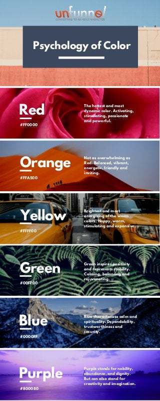
- 1. Red #FF0000 Orange #FFA500 Yellow #FFFF00 The hottest and most dynamic color. Activating, stimulating, passionate and powerful. Not as overwhelming as Red. Balanced, vibrant, energetic, friendly and inviting. Brightest and most energizing of the warm colors. Happy, warm, stimulating and expansive. Green #00FF00 Blue #0000FF Purple #800080 Green inspires positivity and represents stability. Calming, balancing and rejuvenating. Blue characterises calm and spirituality. Dependability, trustworthiness and security. Purple stands for nobility, abundance, and dignity. But can also stand for creativity and imagination. Psychology of Color Psychology of Color